|
Step-by-Step Tutorial: Responsive HTML Newsletters Made Easy - Part 1
By Jani Kumpula
Senior Webmaster/User Interface Designer, L-Soft
In today's email landscape, if your HTML newsletters aren't optimized for mobile devices, you're missing out on many opportunities to truly connect with your subscribers. The good news is that for the most part, email clients, webmail clients and mobile email apps have all taken strides in recent years to improve their support for media queries and responsive design, so you no longer have an excuse. This step-by-step tutorial will show how you can easily create a responsive HTML newsletter with the help of reusable and customizable code blocks.
Coding HTML for Email
If you have ever worked with HTML newsletters, you will know that coding HTML for email is very different than coding HTML for websites. Even the best email clients don't support HTML standards as well as web browsers. In particular, floating div blocks and CSS-based positioning is very poorly supported. If you want consistent rendering across different email clients, your design simply has to be table-based. Because some email clients still ignore CSS declarations in the head of the document, it's also important to inline your styles. All of the nested tables and inline CSS will undoubtedly make your HTML more complex than if you were creating a web page. However, if you approach the design systematically, creating a beautiful HTML newsletter is not as difficult as it may appear.
Newsletter Structure
Let's take a step-by-step approach and create a responsive HTML newsletter from scratch. Our newsletter is going to be a monthly newsletter containing the latest travel deals for an imaginary airline with a mixture of several types of content blocks. The first step is to prepare the structure of the newsletter, including the head and the body.
View HTML Code in New Window
<!DOCTYPE html PUBLIC "-//W3C//DTD XHTML 1.0 Transitional//EN" "http://www.w3.org/TR/xhtml1/DTD/xhtml1-transitional.dtd">
<html xmlns="http://www.w3.org/1999/xhtml">

<head>
<meta name="viewport" content="width=device-width, initial-scale=1.0" />
<meta http-equiv="X-UA-Compatible" content="IE=edge" />
<title>Newsletter</title>
<style type="text/css">
html { width: 100% !important; height: 100% !important; }
body, #bodytable { width: 100% !important; height: 100% !important; margin: 0; padding: 0; }
body, table, td, p, a, li, blockquote { -ms-text-size-adjust: 100%; -webkit-text-size-adjust: 100%; }
table, td { border-collapse: collapse; mso-table-lspace: 0pt; mso-table-rspace: 0pt; }
img { -ms-interpolation-mode: bicubic; }
img, a img { border: 0; outline: none; text-decoration: none; }
.ReadMsgBody { width: 100%; }
.ExternalClass { width: 100%; }
.ExternalClass, .ExternalClass p, .ExternalClass span, .ExternalClass font, .ExternalClass td, .ExternalClass div { line-height: 100%; }
@media only screen and (max-width: 650px) {
.container { width: 100% !important; }
.cell { width: 100% !important; display: block !important; padding: 0px !important; }
.table { width: 100% !important; display: block !important; padding: 0px !important; }
.header-l { font-size: 18px !important; }
.header-s { font-size: 16px !important; }
}
</style>
</head>

<body bgcolor="#EFEFEF" style="background-color: #EFEFEF">

<style type="text/css">
@media only screen and (max-width: 650px) {
.container { width: 100% !important; }
.cell { width: 100% !important; display: block !important; padding: 0px !important; }
.table { width: 100% !important; display: block !important; padding: 0px !important; }
.header-l { font-size: 18px !important; }
.header-s { font-size: 16px !important; }
}
</style>

<!-- BACKGROUND TABLE START -->
<table border="0" cellpadding="0" cellspacing="0" height="100%" id="bodytable" style="width: 100%; height: 100%; margin: 0px; padding: 0px; min-width: 320px" width="100%">
  <tr>
    <td align="center" bgcolor="#EFEFEF" style="background-color: #EFEFEF; vertical-align: top" valign="top">

      ...

    </td>
  </tr>
</table>
<!-- BACKGROUND TABLE END -->

</body>

</html>
For our purposes, the most important lines to pay attention to include the viewport, which tells email clients to use the width of the device as the viewport with an initial scale of 1 (no zooming), and the media query, which only applies if the width of the viewport is less than 650px, which will be the full width of our sample newsletter. Anything less than that, and we're telling the email client to make some strategic changes to the layout to ensure that it fits inside the viewport of the device.
Note that I'm placing the same media query inside the head and the body of the newsletter because some email clients (like the Yahoo Android email app) ignore media queries inside the head. The other style attributes are so called resets. Among other things, they ensure that the body of the email has a width and height of 100%, which allows us to use background colors other than the default white. They also deal with a number of client-specific quirks, preventing unwanted resizing of text or extra spacing around images. Some of the reset styles may be unnecessary for our purposes, but it doesn't hurt to use the whole block as is. If you want more detail about what all of the reset styles do, Litmus has a thorough rundown.
As for the body of the email, we're giving it a light gray background color. We're also wrapping a background table around the content with a width and height of 100% and the same light gray background color for those email clients that don't support background colors assigned to the body tag itself. I find that it's always a good idea to repeat the styles both as HTML attributes as well as CSS properties whenever possible to ensure maximum support among the wide variety of email clients.
Preheader and Postfooter
Now that we have the structure done, let's work on the actual body of the newsletter. We will do this by nesting tables and stand-alone content blocks. For our newsletter, the blocks will be nested as follows:
View HTML Code in New Window
<!-- BACKGROUND TABLE START -->

      <!-- PREHEADER START -->
      <!-- PREHEADER END -->

      <!-- BORDER TABLE START -->

            <!-- HEADER START -->
            <!-- HEADER END -->

            <!-- ONE-COLUMN BLOCK START -->
            <!-- ONE-COLUMN BLOCK END -->

            <!-- TWO-COLUMN BLOCK START -->
            <!-- TWO-COLUMN BLOCK END -->

            <!-- THREE-COLUMN BLOCK START -->
            <!-- THREE-COLUMN BLOCK END -->

            <!-- FOOTER START -->
            <!-- FOOTER END -->

      <!-- BORDER TABLE END -->

      <!-- POSTFOOTER START -->
      <!-- POSTFOOTER END -->

<!-- BACKGROUND TABLE END -->
The first thing that we'll do is create the preheader, which is shown at the very top of the newsletter, and what I like to call the postfooter, which comes at the very bottom. All of these nested blocks will go inside the background table that we created above.
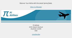
In addition to the subject line, many email clients show the first sentence from the email in the overview table, so the preheader gives you an extra opportunity to elaborate on the content of the newsletter and entice subscribers to open it. As for the postfooter, this is where you would traditionally place the name, address and contact information for your organization, which is required by law in many countries, as well as the all-important unsubscribe link.
View HTML Code in New Window
<!-- PREHEADER START -->
<div><br /></div>
<table border="0" cellpadding="0" cellspacing="0" class="container" style="width: 650px" width="650">
  <tr>
    <td>
      <div style="font-family: Tahoma, Geneva, sans-serif; font-size: 14px; color: #333333; font-style: normal; font-weight: normal; text-align: center">Discover Your Aloha with the Latest Spring Deals.</div>
      <div><br /></div>
      <div style="font-family: Tahoma, Geneva, sans-serif; font-size: 14px; color: #333333; font-style: normal; font-weight: normal; text-align: center"><a href="#" style="font-family: Tahoma, Geneva, sans-serif; font-size: 14px; color: #2181A5; font-style: normal; font-weight: normal; text-decoration: underline"><span style="font-family: Tahoma, Geneva, sans-serif; font-size: 14px; color: #2181A5; font-style: normal; font-weight: normal; text-decoration: underline">View in a Browser</span></a></div>
    </td>
  </tr>
</table>
<div><br /></div>
<!-- PREHEADER END -->
View HTML Code in New Window
<!-- POSTFOOTER START -->
<div><br /></div>
<table border="0" cellpadding="0" cellspacing="0" class="container" style="width: 650px" width="650">
  <tr>
    <td>
      <div style="font-family: Tahoma, Geneva, sans-serif; font-size: 14px; color: #333333; font-weight: normal; font-style: normal; text-align: center">Pi Airlines<br />2000 Airport Avenue<br />Anytown 12345<br />USA</div>
      <div><br /></div>
      <div style="font-family: Tahoma, Geneva, sans-serif; font-size: 14px; color: #333333; font-weight: normal; font-style: normal; text-align: center"><a href="#" style="font-family: Tahoma, Geneva, sans-serif; font-size: 14px; color: #2181A5; font-weight: normal; font-style: normal; text-decoration: underline"><span style="font-family: Tahoma, Geneva, sans-serif; font-size: 14px; color: #2181A5; font-weight: normal; font-style: normal; text-decoration: underline">Unsubscribe</span></a></div>
    </td>
  </tr>
</table>
<div><br /></div>
<!-- POSTFOOTER END -->
If you look at the code, you will notice that we have given our newsletter a maximum width of 650px, which is a good compromise for desktop email clients and tablets. With the help of our media query and "container" class, if the viewport is smaller than 650px, instead of a fixed width, the newsletter will become a fluid 100% of the viewport. In order to prevent some email clients from changing the color and style of the links, we have included an additional span tag around the link text.
Border Table, Header and Footer
Now let's start adding the components that will make up the bulk of the newsletter, starting with a 650px wide border table that wraps around the content, giving it a 1px wide gray border, followed by the header that contains the top banner and a simple footer.
View HTML Code in New Window
<!-- BORDER TABLE START -->
<table border="0" cellpadding="0" cellspacing="0" class="container" style="border: 1px solid #D6D6D6; width: 650px" width="650">
  <tr>
    <td>

      <!-- HEADER START -->
      <table border="0" cellpadding="0" cellspacing="0" style="width: 100% !important" width="100%">
        <tr>
          <td bgcolor="#2181A5" style="background-color: #2181A5; padding: 0px"><div><img alt="Pi Airlines" src="http://www.lsoft.com/mail/banner_648.jpg" style="display: block; height: auto; width: 100%" width="648" /></div></td>
        </tr>
        <tr>
          <td bgcolor="#E6E6E6" height="10" style="background-color: #E6E6E6; height: 10px"></td>
        </tr>
      </table>
      <!-- HEADER END -->

      <!-- FOOTER START -->
      <table border="0" cellpadding="0" cellspacing="0" style="width: 100% !important" width="100%">
        <tr>
          <td bgcolor="#2181A5" height="5" style="background-color: #2181A5; height: 5px"></td>
        </tr>
      </table>
      <!-- FOOTER END -->

    </td>
  </tr>
</table>
<!-- BORDER TABLE END -->
 Since the 650px wide border table has a 1px border (on all sides), the content blocks inside will be 648px wide, so the top banner has been sized and coded accordingly. Just like the preheader and the postfooter, the border table has been assigned the "container" class to change the width to a fluid 100% when the viewport is smaller than 650px. Since the banner image has been given a relative width of 100%, it will automatically shrink once the viewport width falls below 648px.
In the footer, I could just as well have included some text, for example copyright details, contact information, unsubscribe information and so on, but since we already have it in the postfooter, I decided to make it a simple colored line instead.
Now we have the structure, preheader, postfooter, header and footer done. To view our work so far, see:
http://www.lsoft.com/mail/pi-step1.html
To see the media query in action, you can simply resize the browser window below 650px.
One-Column Content Block
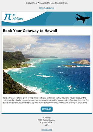
Let's continue by adding a one-column, full-width content block for our main deal of the month.
View HTML Code in New Window
<!-- ONE-COLUMN BLOCK START -->
<table border="0" cellpadding="0" cellspacing="0" style="width: 100%" width="100%">
  <tr>
    <td bgcolor="#FFFFFF" style="background-color: #FFFFFF">
      <table border="0" cellpadding="0" cellspacing="0" style="width: 100% !important" width="100%">
        <tr>
          <td style="padding: 10px"><div class="header-l" style="font-family: Tahoma, Geneva, sans-serif; font-size: 26px; color: #333333; font-style: normal; font-weight: bold; text-align: left">Book Your Getaway to Hawaii</div></td>
        </tr>
        <tr>
          <td style="padding: 10px"><div><img alt="Hawaii" src="http://www.lsoft.com/mail/hawaii_628.jpg" style="display: block; height: auto; width: 100%" width="628" /></div></td>
        </tr>
        <tr>
          <td style="padding: 10px"><div style="font-family: Tahoma, Geneva, sans-serif; font-size: 14px; color: #333333; font-style: normal; font-weight: normal; text-align: left">Take advantage of our great spring deals on flights to Hawaii, Oahu, Maui and Kauai. Discover the culture of the islands, explore hidden treasures and soak up the sun on miles of pristine beaches. For active and adventurous travelers, try your hand at rock climbing, surfing, paragliding or snorkeling.</div></td>
        </tr>
        <tr>
          <td style="padding: 10px">
            <table align="center" border="0" cellpadding="0" cellspacing="0" style="text-align: center; margin-left: auto; margin-right: auto">
              <tr>
                <td align="center" bgcolor="#2181A5" style="background-color: #2181A5; padding: 10px; border-radius: 10px; -webkit-border-radius: 10px; -moz-border-radius: 10px"><a href="#" style="font-family: Tahoma, Geneva, sans-serif; font-size: 14px; color: #FFFFFF; font-style: normal; font-weight: bold; text-align: center; text-decoration: none"><span style="font-family: Tahoma, Geneva, sans-serif; font-size: 14px; color: #FFFFFF; font-style: normal; font-weight: bold; text-align: center; text-decoration: none">EXPLORE</span></a></td>
              </tr>
            </table>
          </td>
        </tr>
      </table>
    </td>
  </tr>
</table>
<!-- ONE-COLUMN BLOCK END -->
 As you can see, the structure is straightforward. We are simply nesting tables. If you pay attention to the large headline, you will notice that it has been assigned a class named "header-l", which is in our media query. This means that on a screen that can support the full width of the newsletter, the headline is shown at a size of 26px. The media query simply reduces this size to 18px on smaller devices for a better fit.
You will also notice that instead of the simple styling of the browser and unsubscribe links, we are giving a lot more elaborate treatment to the link here. It's still a link, but the link text has been placed inside a table with padding and rounded corners, creating a button, which is a much more prominent call to action. Keep in mind, however, that some email clients (like the Outlook desktop client) don't support rounded corners, so those subscribers will end up seeing sharp corners instead.
To view the results so far, see:
http://www.lsoft.com/mail/pi-step2.html
Two-Column Content Block
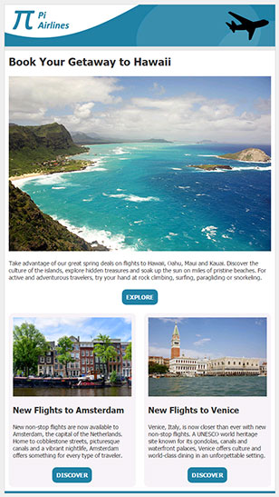
Now let's add a second content block with more flight deals. Where media queries really shine is in their ability to change the layout of a newsletter with multiple columns.
View HTML Code in New Window
<!-- TWO-COLUMN BLOCK START -->
<table border="0" cellpadding="0" cellspacing="0" style="width: 100%" width="100%">
  <tr>
    <td bgcolor="#FFFFFF" style="background-color: #FFFFFF">
      <table border="0" cellpadding="0" cellspacing="0" style="width: 100% !important" width="100%">
        <tr>
          <td class="cell" style="width: 50%; vertical-align: top" width="50%" valign="top">
            <table border="0" cellpadding="0" cellspacing="0" style="width: 100% !important" width="100%">
              <tr>
                <td style="padding: 10px">
                  <table border="0" cellpadding="0" cellspacing="0" style="width: 100% !important" width="100%">
                    <tr>
                      <td style="background-color: #F0F0F0; padding: 10px; border-radius: 10px; -webkit-border-radius: 10px; -moz-border-radius: 10px">
                        <table border="0" cellpadding="0" cellspacing="0" style="width: 100% !important" width="100%">
                          <tr>
                            <td style="padding: 0px 0px 10px 0px"><div><img alt="Amsterdam" src="http://www.lsoft.com/mail/amsterdam_628.jpg" style="display: block; height: auto; width: 100%" width="284" /></div></td>
                          </tr>
                          <tr>
                            <td style="padding: 10px 0px 10px 0px"><div class="header-s" style="font-family: Tahoma, Geneva, sans-serif; font-size: 20px; color: #333333; font-weight: bold; font-style: normal; text-align: left">New Flights to Amsterdam</div></td>
                          </tr>
                          <tr>
                            <td style="padding: 10px 0px 10px 0px"><div style="font-family: Tahoma, Geneva, sans-serif; font-size: 14px; color: #333333; font-style: normal; font-weight: normal; text-align: left">New non-stop flights are now available to Amsterdam, the capital of the Netherlands. Home to cobblestone streets, picturesque canals and a vibrant nightlife, Amsterdam offers something for every type of traveler.</div></td>
                          </tr>
                          <tr>
                            <td style="padding: 10px 0px 0px 0px">
                              <table align="center" border="0" cellpadding="0" cellspacing="0" style="text-align: center; margin-left: auto; margin-right: auto">
                                <tr>
                                  <td align="center" bgcolor="#2181A5" style="background-color: #2181A5; padding: 10px; border-radius: 10px; -webkit-border-radius: 10px; -moz-border-radius: 10px"><a href="#" style="font-family: Tahoma, Geneva, sans-serif; font-size: 14px; color: #FFFFFF; font-style: normal; font-weight: bold; text-align: center; text-decoration: none"><span style="font-family: Tahoma, Geneva, sans-serif; font-size: 14px; color: #FFFFFF; font-style: normal; font-weight: bold; text-align: center; text-decoration: none">DISCOVER</span></a></td>
                                </tr>
                              </table>
                            </td>
                          </tr>
                        </table>
                      </td>
                    </tr>
                  </table>
                </td>
              </tr>
            </table>
          </td>
          <td class="cell" style="width: 50%; vertical-align: top" width="50%" valign="top">
            <table border="0" cellpadding="0" cellspacing="0" style="width: 100% !important" width="100%">
              <tr>
                <td style="padding: 10px">
                  <table border="0" cellpadding="0" cellspacing="0" style="width: 100% !important" width="100%">
                    <tr>
                      <td style="background-color: #F0F0F0; padding: 10px; border-radius: 10px; -webkit-border-radius: 10px; -moz-border-radius: 10px">
                        <table border="0" cellpadding="0" cellspacing="0" style="width: 100% !important" width="100%">
                          <tr>
                            <td style="padding: 0px 0px 10px 0px"><div><img alt="Venice" src="http://www.lsoft.com/mail/venice_628.jpg" style="display: block; height: auto; width: 100%" width="284" /></div></td>
                          </tr>
                          <tr>
                            <td style="padding: 10px 0px 10px 0px"><div class="header-s" style="font-family: Tahoma, Geneva, sans-serif; font-size: 20px; color: #333333; font-weight: bold; font-style: normal; text-align: left">New Flights to Venice</div></td>
                          </tr>
                          <tr>
                            <td style="padding: 10px 0px 10px 0px"><div style="font-family: Tahoma, Geneva, sans-serif; font-size: 14px; color: #333333; font-style: normal; font-weight: normal; text-align: left">Venice, Italy, is now closer than ever with new non-stop flights. A UNESCO world heritage site known for its gondolas, canals and waterfront palaces, Venice offers culture and world-class dining in an unforgettable setting.</div></td>
                          </tr>
                          <tr>
                            <td style="padding: 10px 0px 0px 0px">
                              <table align="center" border="0" cellpadding="0" cellspacing="0" style="text-align: center; margin-left: auto; margin-right: auto">
                                <tr>
                                  <td align="center" bgcolor="#2181A5" style="background-color: #2181A5; padding: 10px; border-radius: 10px; -webkit-border-radius: 10px; -moz-border-radius: 10px"><a href="#" style="font-family: Tahoma, Geneva, sans-serif; font-size: 14px; color: #FFFFFF; font-style: normal; font-weight: bold; text-align: center; text-decoration: none"><span style="font-family: Tahoma, Geneva, sans-serif; font-size: 14px; color: #FFFFFF; font-style: normal; font-weight: bold; text-align: center; text-decoration: none">DISCOVER</span></a></td>
                                </tr>
                              </table>
                            </td>
                          </tr>
                        </table>
                      </td>
                    </tr>
                  </table>
                </td>
              </tr>
            </table>
          </td>
        </tr>
      </table>
    </td>
  </tr>
</table>
<!-- TWO-COLUMN BLOCK END -->
 If you look closely at the code, you will notice that I have two table cells, each with a width of 50%. I have assigned those two cells the class "cell", which is in our media query. If the viewport is larger than 650px, you will see those two cells side-by-side. However, once the viewport falls below 650px, the media query gives those two cells a width of 100%. Instead of side-by-side, they will then be stacked, one above the other. Note that the two columns don't necessarily have to be 50%-50%. I can just as well give one column a width of 40% and the other one a width of 60%.
Generally, when creating HTML newsletters, you make sure to resize your images to the appropriate size (in this case 284 pixels) before saving them on your server. However, this example shows that you don't necessarily have to do that. Both of the images are actually 628px wide, just like the image used in the one-column block. When you give images a relative width of 100%, you can not only make them bigger, but you can make them smaller too. The one required workaround, however, is that I need to explicitly add width="284" to the image tags because Outlook doesn't support relative widths for images, so they would otherwise always be displayed at their full 628px in Outlook, which would make the two-column block a one-column block instead.
To view the results so far, see:
http://www.lsoft.com/mail/pi-step3.html
Three-Column Content Block
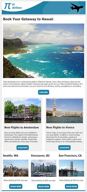
Finally, let's add one more content block to our newsletter, this time a three-column block. The approach is the same as above, except that in this case, I'm going to give all three cells a width of 33% (the leftover 1% will just be used as extra padding). I'm also going to omit the gray box with the rounded corners that I used in the two-column block, which means that I can eliminate one of the nested tables inside each cell.
View HTML Code in New Window
<!-- THREE-COLUMN BLOCK START -->
<table border="0" cellpadding="0" cellspacing="0" style="width: 100%" width="100%">
  <tr>
    <td bgcolor="#FFFFFF" style="background-color: #FFFFFF">
      <table border="0" cellpadding="0" cellspacing="0" style="width: 100% !important" width="100%">
        <tr>
          <td class="cell" style="width: 33%; vertical-align: top" width="33%" valign="top">
            <table border="0" cellpadding="0" cellspacing="0" style="width: 100% !important" width="100%">
              <tr>
                <td style="padding: 10px"><div class="header-s" style="font-family: Tahoma, Geneva, sans-serif; font-size: 20px; color: #333333; font-weight: bold; font-style: normal; text-align: left">Seattle, WA</div></td>
              </tr>
              <tr>
                <td style="padding: 10px"><div><img alt="Seattle, WA" src="http://www.lsoft.com/mail/seattle_628.jpg" style="display: block; height: auto; width: 100%" width="196" /></div></td>
              </tr>
              <tr>
                <td style="padding: 10px"><div style="font-family: Tahoma, Geneva, sans-serif; font-size: 14px; color: #333333; font-style: normal; font-weight: normal; text-align: center">Fares starting at $79 one way.</div></td>
              </tr>
              <tr>
                <td style="padding: 10px">
                  <table align="center" border="0" cellpadding="0" cellspacing="0" style="text-align: center; margin-left: auto; margin-right: auto">
                    <tr>
                      <td align="center" bgcolor="#2181A5" style="background-color: #2181A5; padding: 10px; border-radius: 10px; -webkit-border-radius: 10px; -moz-border-radius: 10px"><a href="#" style="font-family: Tahoma, Geneva, sans-serif; font-size: 14px; color: #FFFFFF; font-style: normal; font-weight: bold; text-align: center; text-decoration: none"><span style="font-family: Tahoma, Geneva, sans-serif; font-size: 14px; color: #FFFFFF; font-style: normal; font-weight: bold; text-align: center; text-decoration: none">BOOK NOW</span></a></td>
                    </tr>
                  </table>
                </td>
              </tr>
            </table>
          </td>
          <td class="cell" style="width: 33%; vertical-align: top" width="33%" valign="top">
            <table border="0" cellpadding="0" cellspacing="0" style="width: 100% !important" width="100%">
              <tr>
                <td style="padding: 10px"><div class="header-s" style="font-family: Tahoma, Geneva, sans-serif; font-size: 20px; color: #333333; font-weight: bold; font-style: normal; text-align: left">Vancouver, BC</div></td>
              </tr>
              <tr>
                <td style="padding: 10px"><div><img alt="Vancouver, BC" src="http://www.lsoft.com/mail/vancouver_628.jpg" style="display: block; height: auto; width: 100%" width="196" /></div></td>
              </tr>
              <tr>
                <td style="padding: 10px"><div style="font-family: Tahoma, Geneva, sans-serif; font-size: 14px; color: #333333; font-style: normal; font-weight: normal; text-align: center">Fares starting at $89 one way.</div></td>
              </tr>
              <tr>
                <td style="padding: 10px">
                  <table align="center" border="0" cellpadding="0" cellspacing="0" style="text-align: center; margin-left: auto; margin-right: auto">
                    <tr>
                      <td align="center" bgcolor="#2181A5" style="background-color: #2181A5; padding: 10px; border-radius: 10px; -webkit-border-radius: 10px; -moz-border-radius: 10px"><a href="#" style="font-family: Tahoma, Geneva, sans-serif; font-size: 14px; color: #FFFFFF; font-style: normal; font-weight: bold; text-align: center; text-decoration: none"><span style="font-family: Tahoma, Geneva, sans-serif; font-size: 14px; color: #FFFFFF; font-style: normal; font-weight: bold; text-align: center; text-decoration: none">BOOK NOW</span></a></td>
                    </tr>
                  </table>
                </td>
              </tr>
            </table>
          </td>
          <td class="cell" style="width: 33%; vertical-align: top" width="33%" valign="top">
            <table border="0" cellpadding="0" cellspacing="0" style="width: 100% !important" width="100%">
              <tr>
                <td style="padding: 10px"><div class="header-s" style="font-family: Tahoma, Geneva, sans-serif; font-size: 20px; color: #333333; font-weight: bold; font-style: normal; text-align: left">San Francisco, CA</div></td>
              </tr>
              <tr>
                <td style="padding: 10px"><div><img alt="San Francisco, CA" src="http://www.lsoft.com/mail/sanfrancisco_628.jpg" style="display: block; height: auto; width: 100%" width="196" /></div></td>
              </tr>
              <tr>
                <td style="padding: 10px"><div style="font-family: Tahoma, Geneva, sans-serif; font-size: 14px; color: #333333; font-style: normal; font-weight: normal; text-align: center">Fares starting at $99 one way.</div></td>
              </tr>
              <tr>
                <td style="padding: 10px">
                  <table align="center" border="0" cellpadding="0" cellspacing="0" style="text-align: center; margin-left: auto; margin-right: auto">
                    <tr>
                      <td align="center" bgcolor="#2181A5" style="background-color: #2181A5; padding: 10px; border-radius: 10px; -webkit-border-radius: 10px; -moz-border-radius: 10px"><a href="#" style="font-family: Tahoma, Geneva, sans-serif; font-size: 14px; color: #FFFFFF; font-style: normal; font-weight: bold; text-align: center; text-decoration: none"><span style="font-family: Tahoma, Geneva, sans-serif; font-size: 14px; color: #FFFFFF; font-style: normal; font-weight: bold; text-align: center; text-decoration: none">BOOK NOW</span></a></td>
                    </tr>
                  </table>
                </td>
              </tr>
            </table>
          </td>
        </tr>
      </table>
    </td>
  </tr>
</table>
<!-- THREE-COLUMN BLOCK END -->
 In all of these content blocks, you could argue that I'm using more nested tables and rows than I really need. For example, in the three-column block above, it isn't necessary to put each content element inside its own table row and cell. However, doing that gives the code blocks a lot of flexibility since I can adjust the padding and any background colors separately from the content. However, if you want to simplify the code, it is completely fine to place the headline, image, content and call to action inside the same table cell too.
Now that the entire newsletter is finished, let's take a look at the final product:
http://www.lsoft.com/mail/pi-final.html
Remember to resize your browser window to see how the columns are rearranged and how the headline sizes are reduced as you go to a smaller viewport.
Conclusion
Hopefully, with the above building blocks, you can be well on your way to creating beautiful newsletters that are optimized for all types of devices. Despite recent improvements, however, it's important to remember that support for HTML, CSS and media queries is still not where it should be in email clients, so don't expect perfection. Testing is still required, especially since email clients can and are known to change overnight and without notice. This being said, it's clear that the future of email is increasingly mobile, so the sooner you buy into this paradigm, the better your results will be.
All Components
You can use the HTML code and these content blocks to create your own HTML templates in LISTSERV. To create placeholders, simply replace all the sample headlines, text, images and links with placeholders like &*HEADLINE;, &*TEXT;, &*IMAGE;, &*LINKTEXT; and &*URL;, and you're good to go.
Subscribe to LISTSERV at Work.
|