|
Tech Tip (LISTSERV Maestro) – Issue 1 – 2008
Q: How can I customize the LISTSERV Maestro Dashboard so the information that's important to me is most prominent?
Answer by Françoise Becker
VP Software Engineering, L-Soft
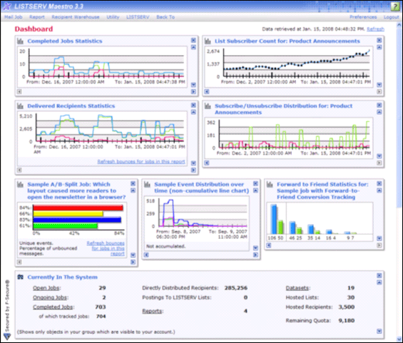
You can easily rearrange dashboard sections and add graphs to your dashboard so that the information you are most interested in is at the top. For example, perhaps you are interested in seeing an overview of all jobs and subscriptions, or perhaps you want to focus on a particular category of jobs, or monitor the activities related to a particular dataset or even a single list. This is all possible. With the newly released LISTSERV Maestro 3.3, you have the ability to add reports to the dashboard, giving you immediate access to your most important metrics.
When using the LISTSERV Maestro dashboard, you will notice that it is divided into multiple sections that can be re-organized quite easily. For instance, you can move any section up or down in order of importance; and you can also hide sections that don't interest you and show only those that do. Changes to the dashboard are persistent from session to session, which means that any rearranging you do or reports that you add will be available each time you log in.
By default, the dashboard contains the following sections:
- Currently In The System summarizes the jobs and data available to the logged-in account.
- Recently Visited provides links to the most recently visited jobs, reports, and datasets in this session.
- Jobs Due Next shows a list of jobs that are currently open and have an upcoming due date defined.
- Current And Upcoming Deliveries shows a list of jobs that are currently being delivered or are authorized for future deliveries, as well as failed jobs that have not yet been handled.
- Recent Deliveries shows a list of jobs that were recently delivered or failed and closed.
Each of these sections can be hidden or moved. The "x" in the top right corner of each section will hide that section. The arrow boxes in the top and bottom right corners will cause the section to trade places with the section above or below it.
To display a hidden section, click on the Hide/Show Dashboard Sections link at the bottom right of the dashboard screen. The newly revealed section will be placed at the bottom of the dashboard and can be moved up to the desired location.
To add a graphical report to the dashboard, go to the report you want to add, click on the Report menu, and then select Add Report to Dashboard. The report will be added to the bottom of the dashboard and can be moved up to the desired location.
If you add another report to the dashboard and move it up from the location directly before the first report, then the two reports will be displayed side by side. New left/right arrow boxes are displayed for each report, giving you the ability to move the reports sideways. If you move the report up again, each report will be again on a line by itself and these new arrow boxes will no longer be available.
The reports shown on the dashboard are shrunken and do not include all the details of the original report. By clicking on one of the reports on the dashboard, you can access the full report. Any changes you make to the full report can be applied to the dashboard version of the report by clicking on the Report menu, and then selecting Apply Settings To Report On Dashboard.
For more information on customizing the dashboard, including working with multiple dashboards, see the white paper: Dynamic Dashboards: Immediately Accessing Your Most Vital Statistics.
|