 |
||

Q: How can I get my email content to display well in mobile as well as desktop email clients? As everyone knows, usage of smartphones and other mobile devices has increased dramatically in recent years. Today's senders should assume that a large portion of subscribers will view their emails not in a standard desktop email client, but on some sort of mobile device, usually with a relatively small screen. Fluid and Responsive Design If you want your email content to display well, even on smaller screens, you have to employ mechanisms like "fluid design", where the content fluidly resizes itself to adjust to the smaller screen, and "responsive design", where the content responds to different screen sizes by rearranging the layout. Proper fluid and responsive design is complicated enough for normal web pages, but it becomes even more complicated for emails since many common HTML tricks that are used for web pages do not work in email clients. As a result, a good fluid design requires in-depth knowledge of HTML and CSS coding and the various email client quirks that influence it. Fluid Design Widgets in LISTSERV Maestro With LISTSERV Maestro, however, you can create fluid and responsive emails right in the WYSIWYG content editor without any knowledge of HTML coding. You simply make use of the versatile "fluid design widgets" that the LISTSERV Maestro content editor offers. There are several such widgets to choose from, which can also be combined and nested to achieve a wide variety of fluid and responsive effects. The following pictures show a sample newsletter that was created solely with these widgets. The first picture shows the newsletter as it would be displayed in a typical desktop email client. In this version of the newsletter, the images are shown in their original sizes, and the two-column layout elements show their columns side-by-side. 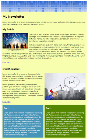 The next three pictures show the same newsletter as it would appear on a smartphone with a smaller screen, where the three pictures show the same newsletter, scrolled to three different positions. 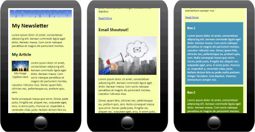 Notice how the text size remains the same, but the images have been resized to fit the smaller screen, and the two-column layout elements have been rearranged into a top-to-bottom layout. Before we examine how this newsletter is constructed using the LISTSERV Maestro fluid design widgets, let's first look at some basics about the widgets. All widgets support styling options via their properties dialogs, for example text color, background color, padding and borders. The widgets will automatically size themselves in a fluid manner to fill out the available width or the user-defined maximum width, whichever is smaller. So a widget with a certain user-defined maximum width will try to assume this defined size but will shrink to a smaller width if necessary, rearranging and resizing its content in the process. But enough of the theory, let's have a look at how the newsletter is constructed. Content Box Widgets Starting off with an empty content page, the first widget that we add is a content box widget. As the name implies, this widget is used as a box for any kind of content, be it text, images, tables or other elements. A content box widget can either be centered or aligned to the left or right, and it can have the surrounding content flow around it or not. 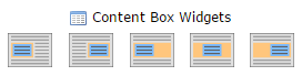 With our sample newsletter, the outermost content box widget is defined as centered, with a maximum width of "700px" and "100% of the parent width". This means that the box can take up 100% of the available width in the parent (if necessary), but never more than 700px. If more space is available, the 700px box will be centered in that space. If less space is available, the box will automatically shrink accordingly. In addition to the width properties, the widget is defined with a light yellow background color and some padding. 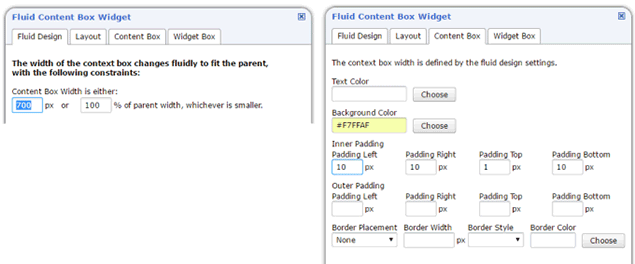 The following picture shows this content box after it has been freshly created, with some sample content already filled in. Note how the yellow content box is centered in the window, which in this example is more than 700px wide. 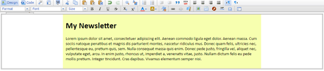 Image Box Widgets The next widget that we add is an image box widget. This widget type is similar to the content box, but in this case, the box always contains an image, no other content. Similar to the content box, the image box can be centered, left-aligned or right-aligned, with the surrounding content flowing around it or not. An image box can also optionally include an editable caption text below the image. 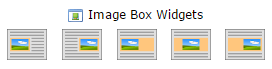 With our sample newsletter, the image box widget is added just above the content box widget, with an image that is 700px wide and that is set to "maximum 100% of the parent width". This means that the image can take up 100% of the available width in the parent (if necessary), but never more than its native width of 700px. If more space is available, the 700px image will be centered in that space. If less space is available, the image will automatically shrink accordingly. In this case, the image was created with a width of 700px deliberately so that the image box widget and the content box widget both have the same width and are flush with each other. The following picture shows the result. 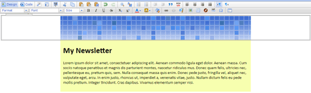 With these two widgets, we have defined the main layout and design of the email. Now let's add some content to it. Combined Image & Content Box Widgets The first content that we add is an article that makes use of a combined image & content box widget. As the name implies, this widget combines both an image and other content into a single widget. The image itself can be either left- or right-aligned in the widget box, and the other content of the widget can either flow around this image or not. The image part can also optionally include an editable caption text below the image. 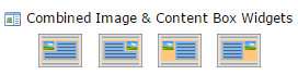 In the case of our sample newsletter, the image & content box combo widget is supplied with a left-aligned image, and the other widget content is set to flow around the image. The supplied image is 206px wide and is set to "maximum 33% of the parent width". This means that the image can take up 33% of the combo widget's width (and thus it still leaves enough space for the other widget content next to the image), but never more than its native 206px width. If more space is available, it will be used up by the other widget content. If the 33% from the parent width amount to less than the 206px image width, the image will automatically shrink accordingly. In addition to the width property, the widget is defined with some padding to the right and at the bottom of the image so that the surrounding content is not too close to the image. The optional image caption is enabled for the image. 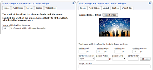 The following picture shows this new combined image & content box widget in place in the newsletter, nested into the main content box widget that we created in the first step. 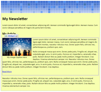 Two-Column Layout Widgets The next content part that we add uses the two-column layout widget. This widget has a classic responsive design behavior. The widget consists of two content boxes that are either shown as two columns, side-by-side, or as two boxes in a top-to-bottom layout. The default layout is the top-to-bottom layout. This default layout is shown if the available width is less than 640 pixels, or if the email client does not support the necessary HTML features for side-by-side columns (for example Outlook). But if the width is 640 pixels or more, and the email client is compliant, then the layout automatically transforms into the side-by-side column layout. The behavior during this switch from top-to-bottom to side-by-side layout can be configured. Either the original top box or bottom box transforms into the new left column (and the other box transforms into the new right column). 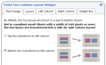 The two-column layout widget comes in three variants, with different space distributions for the side-by-side column layout. The available width can be assigned to the two columns either in "One-Third / Two-Thirds (1:2)", "Fifty / Fifty (1:1)", or "Two-Thirds / One-Third (2:1)" distributions. 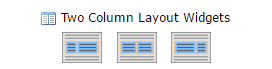 For our sample newsletter, we add a two-column widget with a "Fifty / Fifty" distribution, where the bottom box transforms into the left column. Or in other words, the left column slips below the right column and the right column becomes the top box, if the side-by-side layout is transformed into a top-to-bottom layout. With a widget of this type added, our sample newsletter now looks as shown in the following picture. 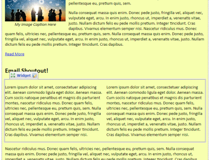 For this particular content part, we want an image in the right column, so we replace the text of the right column with another image box widget. This image box widget is nested into the two-column widget that we created before (more precisely, it is nested into the right column of the two-column widget) and is defined to use 100% of the width of the parent, i.e. 100% of the right column's width. The result is shown in the next picture. Remember that the image with the megaphone that is currently shown in the right column will slip above the article text and become the top box if the layout is transformed into a top-to-bottom layout. 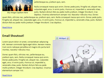 As the final element of our newsletter, we now add another two-column layout widget. Again, the widget is configured with a "Fifty / Fifty" distribution, but this time the left column will transform into the top box if the layout is transformed into a top-to-bottom layout. Also we use the text and background color properties to give the two content boxes a distinct look. The result is shown in the following picture. 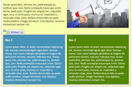 Our sample newsletter is now complete, with a full set of fluid and responsive behaviors, all without a single bit of manual HTML or CSS coding. The Finished Newsletter To fully understand the fluid behavior of the widgets, compare the two versions of the newsletter and notice the differences between the original size and the reduced size on the smartphone: 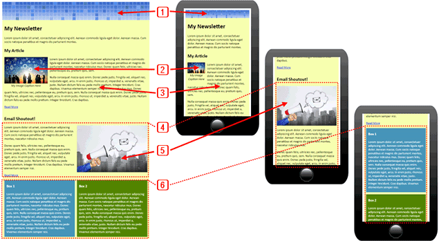 1. The image box widget with the header image 2. The image of the combined image & content box widget 3. The text content of the combined image & content box widget 4. The first two-column layout widget 5. The image box widget that was nested into the right column 6. The second two-column layout widget To view this tech tip as a video tutorial, visit: Subscribe to LISTSERV at Work. |
||
© L-Soft 2016. All Rights Reserved. |
 |