Section 1
Introduction
Section 2
The Maestro Interface
Section 3
Defining a Job
Section 4
Defining Recipients
Section 5
Defining Content
Section 6
Defining Tracking
Section 7
Sender and Delivery Options
Section 8
Outbox
Section 9
Delivered Jobs
Section 10
Reporting and Statistics
10.1.2 Result Settings
10.1.2 Result Settings Continued
10.2 Executing Reports Continued
Section 11
User Settings
Appendix A
24 Hour Clock
Appendix B
International Character Sets
Appendix C
Comma Separated Files
Appendix D
AOL Rich Text
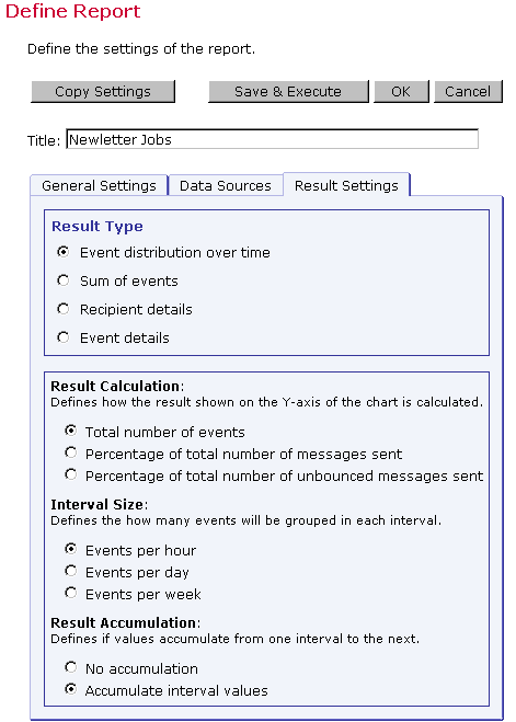
The third tab of the "Define Reports" screen is Result Settings (see Figure 57). Select the type of report to generate as well as how the report data will be displayed. There are four basic types of report listed under "Result Type." The type of report selected will determine the other options that appear in the lower half of the screen. Some report types will have many other options to choose, and other report types will have no additional options to select.
10.1.2.1 Result Settings for Event Distribution Over Time
The "Event distribution over
time" Result Type produces a simple line graph showing
number of responses over time. Time is plotted on the
x-axis of the chart and events are charted on the y-axis.
View examples of this report type.
Options available for this report type include:
-
Result Calculation Defines how the number of events is calculated. There are three choices:
-
Total number of events The y-value of the graph will display the total number of events. For example, if 123 events have been counted for an interval, the resulting line height for that interval on the y-value will be 123.
-
Percentage of the total number of messages sent The y-value shows percentages in relation to the total number of messages sent. For example, if 300 messages were sent, and if, in an interval, 150 events have been counted, then the line height for that interval on the y-value will be 50% (because 150 is 50% of 300). Note: The percentage can be more than 100% if multiple event types are being represented by a given data source, or if single recipients produce multiple events.
-
Percentage of the total number of unbounced messages sent The y-value shows percentages in relation to the total number of messages sent that have not been bounced. For example, if 300 messages were sent, and 50 bounced, there would be a total of 250 unbounced messages. And if, in an interval, 150 events have been counted, then the line height for that interval on the y-value will be 60% (because 150 is 60% of 250).
-
-
Interval Size Defines the size (time period) for each interval on the chart. The number of events that occur within the interval will be plotted on the chart. Intervals can be grouped hourly, daily, or weekly.
-
Result Accumulation Defines whether values plotted on the chart will display cumulatively from one interval to the next, creating an ever increasing line or bar, or whether they will display as non-cumulative intervals, creating a series of peaks and valleys.
Figure 63 Result Settings for Event Distribution Report

10.1.2.2 Result Settings for Sum of Events
This report type produces a bar graph that shows the number of recipients who clicked on each URL and/or opened up the e-mail message. For each job defined as a data source, all events of the selected type (open-up and/or click-through), and for the selected links (in the case of click-through), are summed up and displayed in the form of a colored bar. View examples of this report type.
Options available for this report type include:
-
Result Calculation Defines how the number of events is calculated. There are three choices:
-
Total number of events Displays the total number of events. For example, if 123 events have been counted, the resulting line length will be 123.
-
Percentage of the total number of messages sent Displays percentages in relation to the total number of messages sent. For example, if 300 messages were sent, and if 150 events have been counted, then the line length will be 50% (because 150 is 50% of 300).
-
Percentage of the total number of unbounced messages sent Displays percentages in relation to the total number of messages sent that have not been bounced. For example, if 300 messages were sent, and 50 bounced, there would be a total of 250 unbounced messages. And if 150 events have been counted, then the line length will be 60% (because 150 is 60% of 250).
-
- Unique or Total Events Selects the type of events to include
in the report.
- Count only events unique for each recipient Plots only a single event of each type for each recipient. Recommened when one of the percentage result calculations has been selected. This chart will register "0" (zero) events if blind tracking has been selected for the tracking type during the tracking definition because blind tracking cannot count any event as unique.
- Count all events Plots all events triggered for each recipient and is available for blind tracking.
Figure 64 Results Settings for Sum of Events Report
